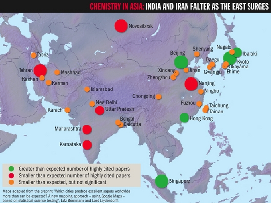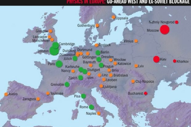
Academics have devised a way to identify and graphically represent the cities with the strongest research performance.
Loet Leydesdorff, professor of the dynamics of scientific communication and technological innovation at the University of Amsterdam, and Lutz Bornmann, a "scientist of science" at the Max Planck Society in Munich, have used data from the Sciverse Scopus citation database to generate maps of research activity.
The technique, published as a preprint on the ArXiv physics database, assumes that 10 per cent of research from each city should be among the global top 10 per cent of papers in terms of citation counts.
Cities exceeding that benchmark are marked with a dark green circle where results are statistically significant and a light green circle where they are not. (The latter are too numerous to be displayed in the maps shown here.)
Cities falling below the benchmark are marked with a red circle if the result is statistically significant, and orange if not. The size of the circles depends on how far results surpass or fall below expectations.
The authors have produced maps for physics, chemistry and psychology. Noteworthy results include the poor performance of Moscow in chemistry and physics, and very strong performances from London and Cambridge in all three subjects.
Professor Leydesdorff said that when policymakers sought to focus on centres of excellence, it was important that they did not simply subsidise output volume.
"An important step is to be able to see whether the excellence is significantly above or below expectations," he said. "Otherwise you always end up with the same metropolitan areas and don't see the small jewels."