Despite the apparently inequitable clustering of universities in certain hot spots across the UK, the correlation between where people study and the distribution of the general population is surprisingly strong, an analysis produced for Times Higher Education has shown.
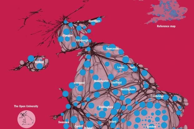
This infographic, made by Benjamin Hennig, senior research fellow in the department of geography at the University of Sheffield, shows the location and size of universities (by 2011-12 student numbers) on a map of the UK that has been altered to reflect population density.
Dr Hennig, whose research focuses on spatial data analysis and geovisualisation, said the analysis shows that the spread of universities – when measured against the general population – is relatively even.
However, the map does reveal a slight imbalance in some areas, with the North West of England from Birmingham right up to the Scottish border being “underserved” by higher education when compared with other areas, he added.
London and the South East dominate much of the distorted map owing to their large populations, although many of the universities in the centre of the capital are shown by small dots, reflecting the relatively small constituent colleges of the University of London.
In the lower left corner of this infographic is a separate map of the UK that has been redrawn to show the distribution of people studying with The Open University across the four different parts of the UK.